Au Bon Pain Rebrand: Clean, Modern, and Global
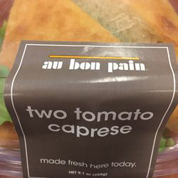
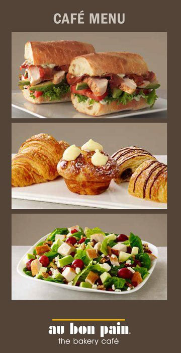
When Au Bon Pain sought a fresh identity, my team led the complete rebranding effort, revitalizing the look and feel of all retail elements, from menu boards and hang tags to labels and seasonal signage. We adopted a clean, modern aesthetic that allowed vibrant, appetizing food photography to take center stage, creating an inviting, visually cohesive experience for customers.
From a new color palette that introduced warm grays as a neutral contrast to the photography and in balance with the iconic golden yellow to new design elements, the update communicates quality and freshness with a modern gourmet sensibility.
From a new color palette that introduced warm grays as a neutral contrast to the photography and in balance with the iconic golden yellow to new design elements, the update communicates quality and freshness with a modern gourmet sensibility.
This reimagined branding extended to all marketing channels and was successfully rolled out internationally, ensuring consistency across markets while elevating the brand’s appeal and reinforcing its position as a global leader in fast-casual dining.
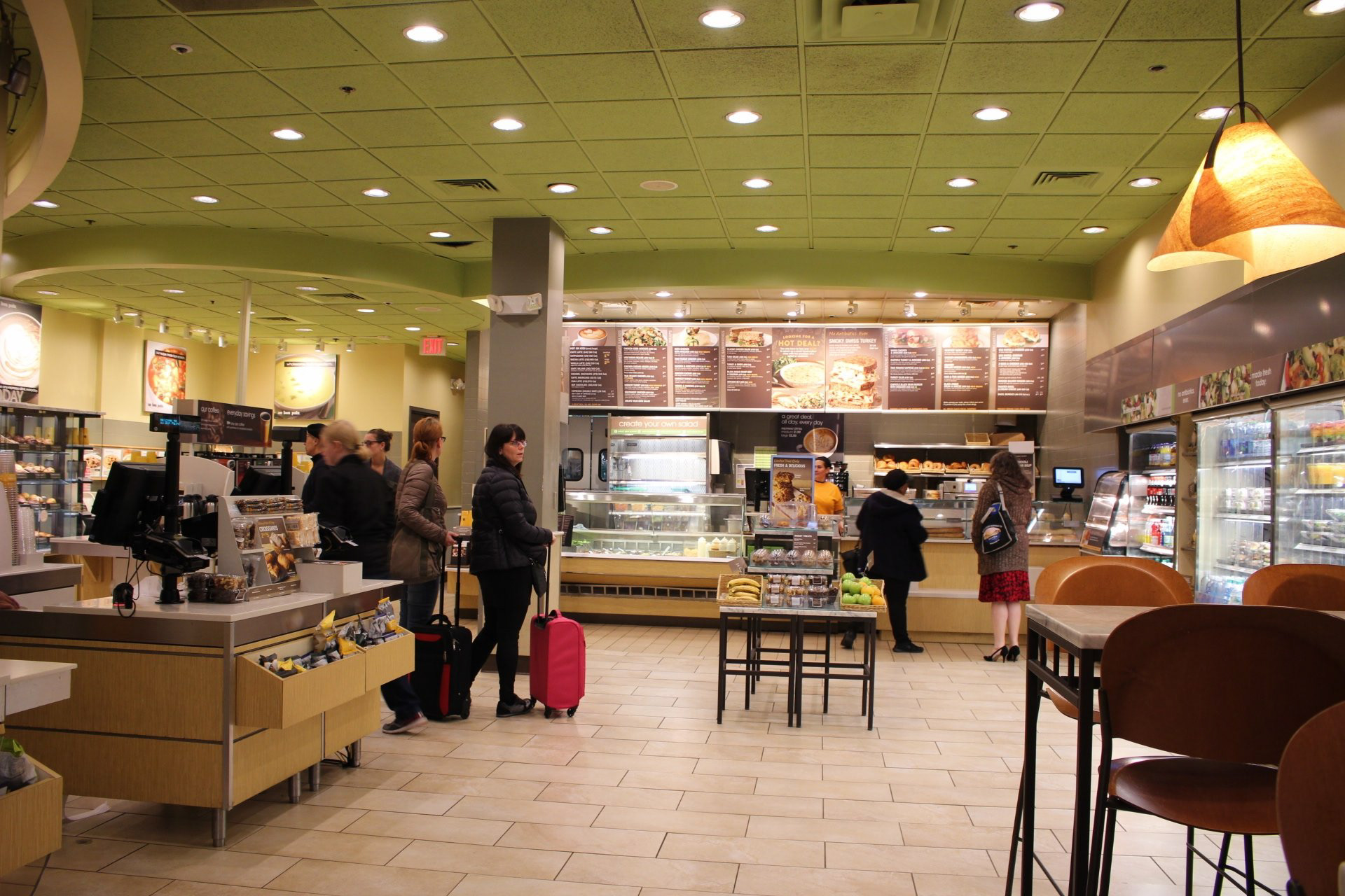
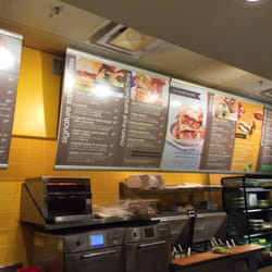
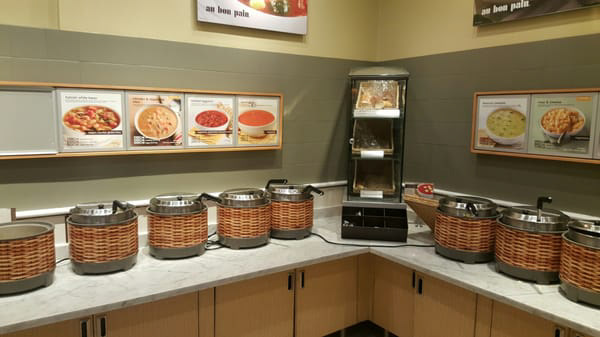
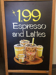
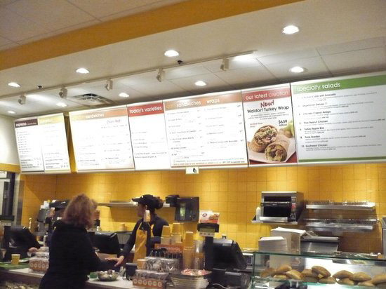
Here is the BEFORE. The brand leaned heavily into bright colors and the menu boards looked like Monopoly property cards.
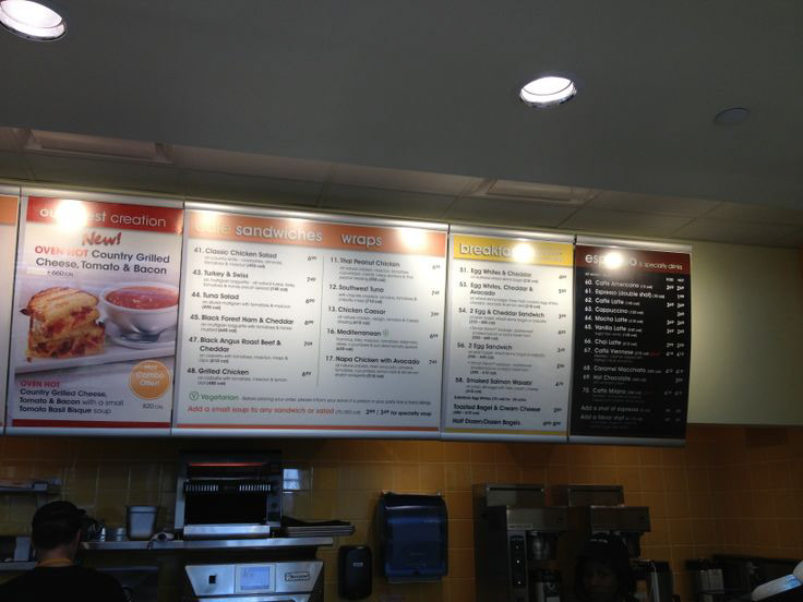
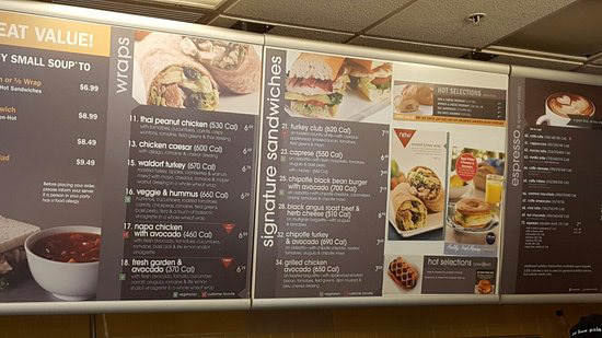
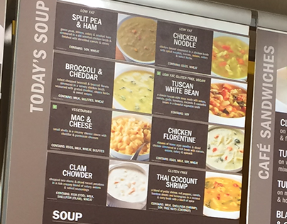
This is the AFTER. The menu boards now included hero images to add appetite appeal and the warm grays created a backdrop for the photography to stand out.
